Minimalist blog template progression
Ok, I put in a little more work into the new blog template tonight. If you’re just joining, in the last entry I declared my intention to create a new, basic minimalist blog template for this site and live blog it.
So, first I created an empty git repository and added a nearly blank readme file to it and threw it on Github.
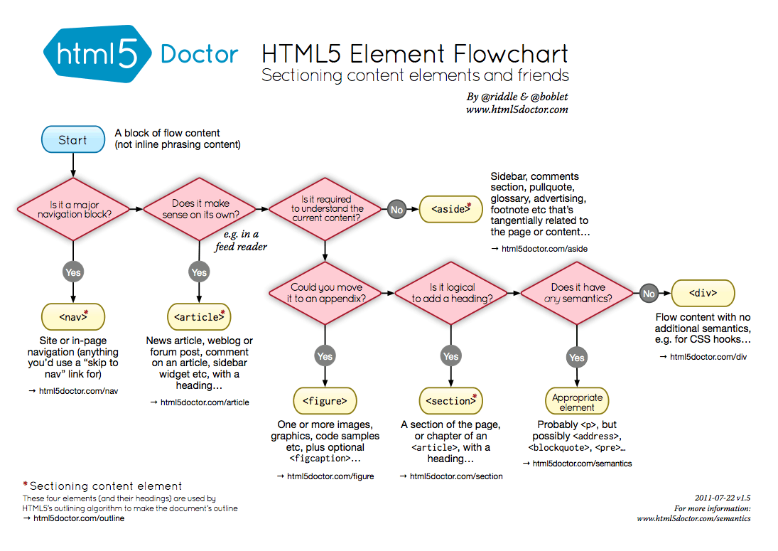
Next is the question of how much HTML5-specific tags to use in the markup. I looked at the source of a few of the minimalist templates out there. The source on Mike Bostock’s blog is very HTML5. There is no head or body tags. Just the doctype, followed by a title tag, style and script tags, then right into content with HTML5 tags – header, aside, footer. Alex Payne’s blog has the more traditional head and body tags, various links and meta tags, etc. It doesn’t really seem to matter. Everyone got along fine before HTML5 tags. I guess they have more semantic meaning than plain divs with semantic classes. I found this handy HTML5 Element Flowchart, just in case you need help making these intense tag name decisions.
Then I went back to the Twitter Bootstrap framework, because I like it’s built in responsive design. I started with the appropriately named “starter template“, which still isn’t 100% minimal – it includes the ubiquitous top navigation bar that every lazy developer who uses Twitter Bootstrap fails to modify, so to start I just copied that file to index.html.

Next, since I’m building bootstrap from source (instructions), I compiled it with “make” and copied over the CSS and JS to an “assets” folder in my template project. Next was simply removing the top navigation bar, since I won’t be using that on the blog. Then to make it more blog like, I put in some long form generic lorem ipsum text and headers, and made it more HTML5-y by adding header, article and footer tags. It didn’t seem to make a difference to the look and feel, so why not.
-
-
-
+
+
Primary Header
+
+
By default, this template resizes as you scale the window up and down, which looks good as it gets smaller, but isn’t very readable for a single column when the screen gets wide. With the chrome inspector pointed at the container element, you can see that depending on the width, different style rules start applying:
@media (min-width: 1200px)
@media (max-width: 979px) and (min-width: 768px)
@media (max-width: 767px)
This is all coming from boostrap-responsive.css. Compiling from source actually turned out to be useful right away, because the LESS templates generate a lot of code for each of those layouts. You could remove them from the generated css file, but it would be a lot more code. With the LESS templates, you can comment out the wide layout in one line, and modify another and have it stop expanding beyond 768px wide:
diff --git a/less/responsive-768px-979px.less b/less/responsive-768px-979px.less
index 76f4f6d..7fa6dd0 100644
--- a/less/responsive-768px-979px.less
+++ b/less/responsive-768px-979px.less
-@media (min-width: 768px) and (max-width: 979px) {
+@media (min-width: 768px) {
diff --git a/less/responsive.less b/less/responsive.less
index 734b198..e8476ea 100644
--- a/less/responsive.less
+++ b/less/responsive.less
@@ -38,7 +38,7 @@
@import "responsive-768px-979px.less";
// Large desktops
-@import "responsive-1200px-min.less";
+// @import "responsive-1200px-min.less";
So far it looks like this. Yes, mind blowing. It’s a good start though.
Comments Off on Minimalist blog template progression
Creating a minimalist blog template
I’ve been meaning to create a new template for this blog. That’s probably not relavant for those of you who read this in a feed reader, it’s more for myself, because I actually look at this thing. I also like reading blogs on their actual sites as opposed to feed readers. I can’t be the only one. The current template is a built-in WordPress theme, and while it’s nice enough, it’s become totally generic and boring to my eyes. It’s also not-invented-here, and we can’t have that, now can we? Well we can, somewhat. I could go full static-blog-generator, use Github pages, or create a brand new blog engine, but WordPress works fine. It has lots of plugins that do everything under the sun. This is just about look and feel.
Another good reason for creating a new template – it’s always good to practice the basics. Like the idea of kata in martial arts, if you continually practice patterns of movement, they become engrained in muscle memory and you’re able to perform them flawlessly without thinking. Or so the theory goes. Master the basics.
Creating the template involves two basic steps: creating the static HTML, and then converting it into a wordpress theme by breaking it into multiple PHP files, adding tags for outputting posts, comments, etc. For the next few blog entries, perhaps I’ll just live-blog the process.
So, first thing to do is decide what it’s going to look like. In the words of Edward Tufte and as mentioned here previously, “above all else, show the data.” In other words, it should be minimal. It should be easy to read. It should get out of the way. Something along the lines of Alex Payne and Mike Bostock‘s blogs, or Gist.io. A clean, uncluttered, single column of text. 13-14pt font size. Lots of white space.
Next, is deciding what, if any pre-existing tools to use to build it. The Twitter Bootstrap framework is nice because you can put together something decent-looking in a relatively short period of time. I’m not looking to reinvent the CSS framework wheel, so I’ll go with that. Only downside is including a lot of CSS I won’t be using, but that can be trimmed down. One bonus is the built in responsive-design support, so things look readable on mobile, and you don’t end up with microscopic text and need to zoom, which is what I’ve got going on now.
There’s a few ways to use Bootstrap. In the past when, I’ve just downloaded the current zip file and copied the precompiled CSS into my projects. That works and gets you up and running with something in a couple minutes. It’s also possible to customize it online and download the result. Or for ultimate flexibility, you can clone the full git repository, then customize and compile the CSS at the source level. I’m going to go the third route this time, because I’m just curious. Maybe I won’t need it. We’ll see tomorrow…
Comments Off on Creating a minimalist blog template
Gun Control
Gun Control is back in the collective mind after this week’s tragedy. A friend’s facebook post stating 100 round drum magazines shouldn’t be legal for citizens turned into a heated discussion with good points from both sides. As for my own personal opinion on this matter, I’m in favor of more regulation of semi-automatic assault-rifle style weapons. I do not think all guns should be outlawed or that the average person’s right to own a hunting rifle or a handgun in order to defend themselves should be taken away. Just that these more-efficient, high-round, long-range weapons ought to be harder to get. Perhaps only by oh, well regulated militias. Aka, trained military personel.
Here’s a link to Jason Alexander’s rant on the topic, expressed more clearly and at length.
Comments Off on Gun Control
Some Bloggers I Like
Leo Babauta of Zen Habits consistently has inspiring things to say, contrarian to the modern world of productivity focused culture we live in today. I feel more relaxed after reading his blog, and that’s reason enough to keep reading it.
Sacha Chua always writes interesting stuff, about starting her own business, learning new skills, and reviewing books with sketch notes.
James Altucher’s writing is like candy. The sentences are short. The titles get your attention. He’s not afraid to bleed. I read one of his ebooks. “How to Be The Luckiest Person Alive.” It was highly entertaining.
Ryan Bates started RailsCasts in 2007. RailsCasts isn’t really a blog. It’s a video tutorial site. Rails originally got popular in part because of short screencast demos. Ryan took this and ran with it, producing at least one new episode a week, teaching how to do some short focused thing in Rails. It started out all free. Now he has a pro-series and charges $9 a month for the more in depth episodes. I signed up immediately, because I already knew it would be quality stuff. I’ve watched many of them. But not all because Ryan produces them faster than I can watch them. I hope he’s making good money because he deserves it.
Being Our Best Selves
A friend of mine was thinking about the loss of his father recently. His father was a great guy who supported my friends and I during our teenagers-with-rock-star-dreams years. He shared a nice anecdote about him. “I will share that his last big proclamation about life was “don’t waste a minute”. We all have goals and plans, but it’s the actual journey that’s life. If you live each day living up to your own personal potential, especially in the way we impact others by being our best selves, no matter what the events of the day bring you can feel good about it.”
Comments Off on Being Our Best Selves
Context Trap
It’s a well known fact that context switching is expensive. It takes a while to ramp your mind into a different task when you’ve been working on another one. Work on project A, work some more, grind away. Now, switch to project B! Nope! Still thinking about A.
I don’t want to complain about the challenges of context switching. In fact I enjoy it, keeping lots of plates spinning at once. If I don’t, I tend to get bored. But therein lies the flaw! I need to make sure to avoid escape from”the busy trap” – doing a bunch of extra stuff voluntarily, because of a need to feel busy. I’m not talking about my one month blogging (and running) challenge that subsequently became a bet, probably for the best. That’s been good, and if anything has forced me to produce something on a daily basis, developing into a good habit, not to mention running 23 miles so far.
I’m enjoying that change and want to channel it into something else. My current monthly burn-rate is too high to go 100% on some non-immediate-income-producing idea, so that’s out. I have some savings but the thought of watching it dwindle while I spend all my time on something that doesn’t immediately generate cashflow is painful.
In August I’m going to suspend the blog-every-day challenge and re-dedicate that extra time to producing a product. Maybe another bet is in order? Working on what your used to is familiar and easy. Working on the important stuff is an exercise in self discipline. The next step is to simplify. And then keep things simple. That requires true discipline.
Comments Off on Context Trap
Learning D3 Part 7: Choropleth Maps
Update: I’m releasing a series of screencast tutorials on D3 at deveo.tv. Check it out and let me know what you think!

Choropleths are maps that indicate variations in data using different shades of color. Turns out you can easily build these using something like D3. How does that work?
// create a geo path - https://github.com/mbostock/d3/wiki/Geo-Paths
var path = d3.geo.path();
// create an svg element
var svg = d3.select("#chart")
.append("svg");
// create a container for counties
var counties = svg.append("g")
.attr("id", "counties")
.attr("class", "Blues");
// create a container for states
var states = svg.append("g")
.attr("id", "states");
// load the county shape data
d3.json("../data/us-counties.json", function(json) {
// create paths for each county using the json data
// and the geo path generator to draw the shapes
counties.selectAll("path")
.data(json.features)
.enter().append("path")
.attr("class", data ? quantize : null)
.attr("d", path);
});
// load the state shape data
d3.json("../data/us-states.json", function(json) {
// create paths for each state using the json data
// and the geo path generator to draw the shapes
states.selectAll("path")
.data(json.features)
.enter().append("path")
.attr("d", path);
});
// load the unemployment by county data
d3.json("unemployment.json", function(json) {
data = json;
// for each county, set the css class using the quantize function
// (an external CSS file contains the css classes for each color in the scheme)
counties.selectAll("path")
.attr("class", quantize);
});
// quantize function takes a data point and returns a number
// between 0 and 8, to indicate intensity, the prepends a 'q'
// and appends '-9'
function quantize(d) {
return "q" + Math.min(8, ~~(data[d.id] * 9 / 12)) + "-9";
}
And the CSS classes for each shade of blue:
.Blues .q0-9{fill:rgb(247,251,255)}
.Blues .q1-9{fill:rgb(222,235,247)}
.Blues .q2-9{fill:rgb(198,219,239)}
.Blues .q3-9{fill:rgb(158,202,225)}
.Blues .q4-9{fill:rgb(107,174,214)}
.Blues .q5-9{fill:rgb(66,146,198)}
.Blues .q6-9{fill:rgb(33,113,181)}
.Blues .q7-9{fill:rgb(8,81,156)}
.Blues .q8-9{fill:rgb(8,48,107)}
Continue with the D3 Series:
Maps, tracking changes, mashing up data
Some links to things I’ve been thinking about / working on lately:
Choropleth Maps: These are maps with color shaded regions for indicating things like which way states went in presidential elections, population density, per capita income, etc. I’m working on making these with D3 (cool example), and will probably post on it soon. Someone else already did.
Paper Trail: I have multiple projects needing some kind of versioning of data right now. There’s lots of ways to do this. You can roll your own, or you can use an open source project with a lot of the edge cases thought out. Papertrail is a versioning gem for Rails projects. It’s quite extensive and lets you do things like undo changes.
Protocolist: Somewhat related to the above, are activity feeds. Track who did what when in your app.
Tabletop.js: This lets you pull data in to web pages from external Google Spreadsheet documents. Could be useful for ad-hoc dataviz stuff, or just general mashup stuff.
Comments Off on Maps, tracking changes, mashing up data
Learning D3 Part 6: Scales & Colors
Update: I’m releasing a series of screencast tutorials on D3 at deveo.tv. Check it out and let me know what you think!
In Learning D3 Part 5, I waxed poetic about D3’s functions for drawing axis lines and labels. This time I’ll talk about scales. Here’s a pretty graph to go with it. This is similar to the earlier examples, but now drawn with SVG, using axes and scales. Ooh la la.

What are scales?
According to the ol’ wikipedia, a scale is “a graduated range of values forming a standard system for measuring or grading something”. In D3 though, scales are functions. “Functions that map from an input domain to an output range”.
In other words, scales are what tell you how many pixels high a bar chart should be with a value of 1 vs 5 vs 7. If you wanted to draw a very tiny bar chart, you could just use those values, and draw bars that are only 1, 5, and 7 pixels high. But if you really want to make your point, you’d probably do better drawing bigger bars.
D3 has some built in scales you can use for convenience. The most common type of scale in D3 is the linear scale.
linear: arranged in or extending along a straight or nearly straight line
scale: a graduated range of values forming a standard system for measuring or grading something
So a linear scale is a scale which the output value increases or decreases in constant proportion to the input value.
The simplest possible scale is a 1:1 scale.
var scale = d3.scale.linear();
scale(1) // 1
scale(2) // 2
Domain
The domain is the range of possible input values in the scale. So I have a series of distances [2.23, 2.39, 2.59, 2.77, 3.05] I might want the domain to range from 0 to 4 or so, to capture the complete range of input values.
Range
The range is the range (again) of possible output values in the scale. Your output values might be in pixels. If you have a 400 pixel wide graph, you’d want to have a range on the x-axis from 0 to 400.
So, just remember domain means input, range means output.
Say we want to draw a very tall bar chart. We might want each input unit to equate to 100 pixels in height. So we’d need a 1:100 scale. Our input values range from 0 to 10, so thats our domain, and our graph is 1000 pixels tall, to accomodate these giant bars, so our output values range from 0 to 1000.
var scale = d3.scale.linear()
.domain([0, 10])
.range([0,1000]);
scale(0) // 0
scale(1) // 100
scale(2) // 200
You can also invert them. This is how you get 0 on the bottom of the Y axis with SVG.
var scale = d3.scale.linear()
.domain([0, 10])
.range([1000,1]);
scale(0) // 1000 - for the y axis, all the way at the bottom
scale(1) // 900 - a little higher
scale(2) // 800 - even higher now
Linear scales are pretty flexible. You can even use them to create color gradients:
var color = d3.scale.linear()
.domain([-1, 0, 1])
.range(["red", "white", "green"]);
color(-1) // "#ff0000" red
color(-0.5) // "#ff8080" pinkish
color(0) // "#ffffff" white
color(0.5) // "#80c080" getting greener
color(0.7) // "#4da64d" almost there..
color(1) // "#008000" totally green!
This is a polylinear scale (aka multiple linear scales in one) lifted straight out of the API docs. The input domain from -1 to 0 maps from red to white, and from 0 to 1 maps from white to green. How cool is that? It calculates the color transitions for you.
Other Kinds of Scales
It doesn’t stop at linear. Oh no. So many more to choose from.
identity: a special kind of linear scale, 1:1, good for pixel values. input == output
power and logarithmic scales: sqrt, pow, log – for exponentially increasing values
quantize and quantile scales: for discrete sets of unique possible values for inputs or outputs
ordinal: for non quantitative scales, like names, categories, etc.
Here’s a running example of the graph at the top. I promise to do something other than bar charts of running distances next time. If you need more excitement right now, here’s a randomly generated, animated donut chart. So crazy.
Bonus question – what’s the redundant, non data-ink on the first chart?
Continue with the D3 Series:
Learning D3 Part 5: Axes
Update: I’m releasing a series of screencast tutorials on D3 at deveo.tv. Check it out and let me know what you think!
In Learning D3 Part 4, I briefly introduced SVG, the differences between SVG and Canvas, and drew a chart grid to illustrate how SVG’s canvas goes from top/left to bottom/right.
D3 has a nice axis component for drawing reference lines, tick marks, and labels, which cleans up some of the code from the previous example. Here’s another good tutorial on it. Here’s the previous example, now drawn using d3.axis.

This example also contains tick marks as part of the axis lines. Might be unnecessary chart-junk depending on the situation, but they’re easily removed if you don’t need them.
Code:
// Define identity (1:1) scales
var x = d3.scale.identity().domain([0,450]);
var y = d3.scale.identity().domain([0,300]);
// Define container
var chart = d3.select("body")
.append("svg")
.attr("class", "chart")
.attr("width", 490)
.attr("height", 330)
.append("g")
// move 0,0 slightly down and right to accomodate axes
.attr("transform", "translate(30,20)");
// Draw X-axis grid lines
chart.selectAll("line.x")
.data(x.ticks(10))
.enter().append("line")
.attr("class", "x")
.attr("x1", x)
.attr("x2", x)
.attr("y1", 0)
.attr("y2", 300)
.style("stroke", "#ccc");
// Draw Y-axis grid lines
chart.selectAll("line.y")
.data(y.ticks(10))
.enter().append("line")
.attr("class", "y")
.attr("x1", 0)
.attr("x2", 450)
.attr("y1", y)
.attr("y2", y)
.style("stroke", "#ccc");
// Define stock x and y axis
var xAxis = d3.svg.axis().scale(x).orient('top');
var yAxis = d3.svg.axis().scale(y).orient('left');
chart.append('g')
.attr("class", "axis")
.call(xAxis);
chart.append('g')
.attr("class", "axis")
.call(yAxis);
Here is the complete working example, with css that cleans up the tick marks.
Still not much to see yet, but I’m establishing the foundation on which to build. 🙂
Continue with the D3 Series: