Continuing my exploration of data visualization tools and principles, I’ve been going through Edward Tufte’s classic book, “The Visual Display of Quantitative Information.” Chapter 4 introduces the idea of Data-Ink, and the Data-Ink Ratio. “Data-Ink is the non-erasable core of a graphic, the non-redundant ink arranged in response to variation in the numbers presented.” (Tufte, 1983) In other words, data-ink represents the data. Everything else, grid lines, grid ticks, labels, framing, is not the data.
The Data-Ink Ratio is the proportion of ink devoted to data vs everything else. Tufte’s core principle here is:
“Above all else, show the data.”
The data should speak for itself as much as possible, and everything else should get out of the way.
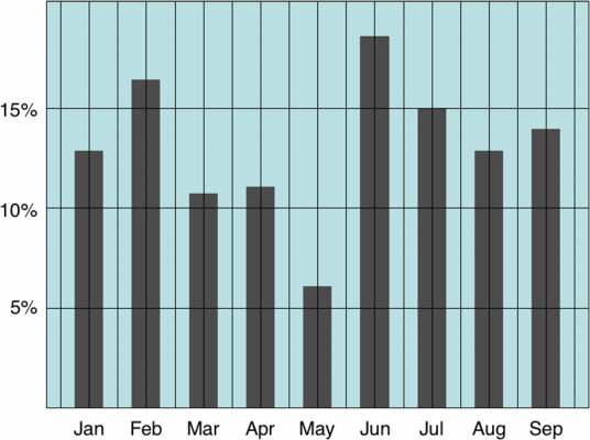
So that’s pretty much common sense. What does it actually look like? Here’s the first and last parts of an example put together by Tim Bray:

This version has lots of ink devoted to extraneous grid lines, background colors, framing, etc. Tim whittles it down to this:

In this version, we lose the grid, the box framing it, the background color, and imply the horizontal scale lines by subtracting ink. It’s a good idea to keep the data-ink ratio in mind when designing data graphics. Of course, it’s an idea to be used in moderation. It’s possible to go overboard. If you lose all of the grid and labeling, the viewer has no reference points, and the data becomes meaningless.
Which do you think is better?
1 Comment
Slow down. It’s friday night. Get off the computer. Shut it down. Meditate. Go outside. Scream. Breathe. Jump around. Think about how awesome life is. Feel grateful.
Comments Off on How to Relax
My friend Kevin wrote a post on advice for new programmers, as it applies to a research/academic environment. It’s good advice, go read it. It got me thinking about how I’ve learned to improve and become a better programmer over the years, and the best things that helped that. For me, I was lucky enough to bootstrap myself into a programming job towards the beginning of college, and ended up learning most of the fundamentals while getting paid to do so on the job. Certainly learning in an academic setting is nice as well, like having the ability to pick a topic and go deep on it without worries of it affecting your paycheck, or necessarily needing to ship a product at the end of your research. But nothing galvanizes the mind like having to complete something in order to get paid! So, one piece of advice to beginners is to try getting a job or internship at a company where you must actually ship a product. It’ll force you to build stuff that works.
Learn your tools. Certainly learning to use tools such as source control, debuggers, and editors makes a huge improvement in workflow.
Read books. There is gold in them. My first web development job was the direct result of picking up a book and teaching myself basic ASP. These days, more and more is on the internet, so you can learn without getting the physical books, so, read PDFs. But actually read them. This is easy and just takes persistence to complete.
Be an apprentice. An even bigger deal early on was working with others who were more experienced than me and picking up how they did things.
Teach. Once you’ve learned how to do something, teach it to the newbies in your company or school. Give talks. A great way to learn something is to explain it to others. It will force you to figure out enough to know what your talking about.
Do a lot of work. Nothing beats experience. Wins, failures, learning what worked and what didn’t, learning how to logically solve problems, how to focus, how to think of the bigger picture.
Communicate. Don’t focus solely on technical skills and neglect personal communication skills. Learn to talk to customers, manage projects, lead meetings, delegate tasks and manage others.
Participate in open source projects, and do something that won’t actually make you money. It might lead to it later on, but in the meantime you’ll become known and get to know others outside your company or school, which is always a good thing.
Socialize. There’s likely at least a handful of monthly groups in your town. Go to them. You will take away new ideas and meet interesting people, who will think of you when their company is looking for more people. Many developers make the mistake of getting comfortable in their cozy job and never going out to events or talking to other developers. That’s fine, but I think it leads to stagnation in skills as well as motivation. Go to a larger conference once in a while. Seeing others at the top of their game in your industry will get you all fired up and want to go kick ass.
Be full stack. Learn all the things! In fact, just enjoy learning. It’s a life long goal. Learn multiple operating systems. Especially Unix – the command line, installing packages, how to set up a server, etc. Learn SQL. Be able to write it by hand, it’s really not that hard. Learn HTML, CSS, and Javascript. Learn Photoshop and Illustrator. Learn multiple programming languages: C, Ruby, JavaScript, Lisp. The more the better. I guarantee the hot language today will be the old boring language in two to five years. But the good thing is, most code sticks around, so demand for the old boring languages never goes away. Or at least diminishes slowly.
Go deep in a few things, go broad on everything else. Over the years I’ve shifted from design to development, so early on I went deep with Photoshop and Illustrator, then later got more heavy into the development side of things, starting with Photoshop, then HTML, ASP, SQL, then moving on from there to a million other things.
So, just do all that, and you’ll be good to go! No problem, right? It’s a life long journey.
Comments Off on How to learn web development
Update: I’m releasing a series of screencast tutorials on D3 at
deveo.tv. Check it out and let me know what you think!
In Learning D3 Part 3, I went over how to add some basic animation and interactivity. This time I’ll go over a big component of D3 and other javascript visualization tools – SVG or Scalable Vector Graphics.
Scalable Vector Graphics
SVG is an XML based, 2 dimensional open-standard that’s been around since 1999. Since SVG graphics are vector based, they can be zoomed or scaled to any resolution without quality loss.
What can you do with it? SVG has a lot of functionality: paths, basic shapes, vertical text, text on a curve, gradient fills, masks, etc.
Canvas
Another tool for adding visuals to the web is the recently added HTML5 Canvas element. SVG and Canvas are not the same thing. Whereas SVG is vector based, Canvas uses raster graphics. SVG elements remain live and addressable in a scene graph (the DOM) after they’ve been rendered to the screen, so you can update them after rendering. Canvas uses a procedural approach – rather than declaring elements with XML, commands are only executed via scripts. In canvas, once an object has been drawn to the screen, it’s forgotten. If you need to move that object, you need to re-render the entire scene.
SVG in D3
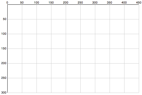
So to get started – we need to learn some more basics of SVG. The axis starts in the top left corner of a root SVG element and counts up as you move down and towards the right. If you have a 500×500 region, the point [0,0] is in the upper left, and [500,500] is in the bottom right.
Here’s a chart to illustrate SVG’s coordinate space, followed by the code to draw the chart.

Now the code:
// Define linear scales representing the pixel dimensions
var x = d3.scale.linear()
    .domain([0, 450])
    .range([0, 450]);

var y = d3.scale.linear()
     .domain([0,300])
     .range([0, 300]);

// define an SVG element to hold our chart
var chart = d3.select("body").append("svg")
    .attr("class", "chart")
    .attr("width", 490) // more space to accomodate our axis labels
    .attr("height", 320) // moar space!
  .append("g")
    .attr("transform", "translate(20,15)"); // move base coordinates over/down a bit so lines start at 0,0

// draw the X grid lines
chart.selectAll("line.x")
    .data(x.ticks(10))
  .enter().append("line")
    .attr("class", "x")
    .attr("x1", x)
    .attr("x2", x)
    .attr("y1", 0)
    .attr("y2", 300)
    .style("stroke", "#ccc");

// draw the Y axis grid lines
chart.selectAll("line.y")
    .data(y.ticks(10))
  .enter().append("line")
    .attr("class", "y")
    .attr("x1", 0)
    .attr("x2", 450)
    .attr("y1", y)
    .attr("y2", y)
    .style("stroke", "#ccc");

// add the X axis labels
chart.selectAll(".rule")
    .data(x.ticks(10))
  .enter().append("text")
    .attr("x", x)
    .attr("y", 0)
    .attr("dy", -3)
    .attr("text-anchor", "middle")
    .text(String);

// add the Y axis labels
chart.selectAll(".rule")
    .data(y.ticks(10))
  .enter().append("text")
    .attr("x", 0)
    .attr("y", y)
    .attr("dy", 3) // shift down slightly
    .attr("dx", -3)  // and to the left
    .attr("text-anchor", "end") // align right
    .text(function(d) { return d == 0 ? '' : d;});

// add the darker X axis line
chart.append("line")
    .attr("x1", 0)
    .attr("x2", 450)
    .style("stroke", "#000");

// add the darker Y axis line
chart.append("line")
    .attr("y1", 0)
    .attr("y2", 300)
    .style("stroke", "#000");
That’s a bit long, eh? Here is the whole example. D3 actually has more convenient functions for drawing axis lines, I’ll leave those for another time. That’s all for tonight!
Continue with the D3 Series:
Comments Off on Learning D3 Part 4: Intro to SVG Graphics
Update: I’m releasing a series of screencast tutorials on D3 at
deveo.tv. Check it out and let me know what you think!

In Learning D3 Part 2, I went over how to bind datasets to the DOM, and get elements on and off the page with enter and exit sub-selections. This time I’ll go over how to add some basic animation and interaction.
Transitions
You specify animations (or other transitions) with the .transition() method, followed by a chain describing the end result. This can include any DOM transformation, such as updates to the width or background color. D3 conveniently calculates the “tween” values for distances and colors, which saves a huge amount of time. You just worry about the values to transition from and to, the duration of the animation, and any delay that should happen before the animation starts.
If you’re drawing a horizontal bar chart of running distances, it might help to convey distance a bit more by animating the growth of each bar horizontally.
var distances = [2.23, 2.39, 2.59, 2.77, 3.05];

d3.select('body').selectAll('div')
  .data(distances)
  .enter()
  .append('div')
  .html('.')
  .style('width', '10px')
  .style('opacity', 0)
  .transition()
    .delay(function(d, i) { return i * 1000 })
    .duration(1000)
    .style('width', function(d) { return (d * 150) + 'px'; })
    .style('opacity', 1)
    .text(function(d) { return d + ' miles'; });
I’m throwing in a few things at once. See it run here. What’s happening? A div is appended for each distance, and initially set to a small width of 10px, the text of “.” and an opacity of 0. It’s invisible! But only for a moment. Then we set up the transition. Each item is delayed 1 second later than the previous using a function returning a multiple of the item index. The duration is set to 1 second with .duration(1000). With this combo, each bar appears in succession. The rest is familiar, setting the full width, label text, and full opacity.
Interaction
Now let’s add some basic user interaction to it, by highlighting the current run when you mouse over it.
var distances = [2.23, 2.39, 2.59, 2.77, 3.05];

d3.select('body').selectAll('div')
  .data(distances)
  .enter()
    .append('div')
    .html('...')
    .style('width', '10px')
    .style('opacity', 0)
    .on("mouseover", function(){
      d3.select(this).transition().duration(300)
        .style("background-color", "#FFD700");
    })
    .on("mouseout", function(){
      d3.select(this).transition().duration(300)
        .style("background-color", "#333");
    })
    .transition()
      .delay(function(d, i) { return i * 300 })
      .duration(300)
      .style('width', function(d) { return (d * 150) + 'px'; })
      .style('opacity', 1)
      .text(function(d) { return d + ' miles'; });
Here’s the running example. Notice the .on(“mouseover”) and .on(“mouseout”) events, describing another transition/animation to fade the background color to yellow and back. The events pass the current context as “this”, which you can again select with d3.select() and apply transitions to.
That’s the basic idea. These basic building blocks are all you really need to build up complex visualizations. I haven’t touched on SVG yet, so that’ll be up next.
Continue with the D3 Series:
3 Comments
Update: I’m releasing a series of screencast tutorials on D3 at
deveo.tv. Check it out and let me know what you think!
In Learning D3, Part 1 I went over some basic concepts of D3 – selections, dynamic properties, and bound data. I’m going to pick back up with data binding, and discuss how new data gets on the page.
Enter and Exit
Let’s say you have some data. It’s in the form of an array of numbers. Each of the numbers represent something, perhaps it’s the number of miles you ran each time you’ve gone for a run so far this month:
var distances = [2.23, 2.39, 2.59, 2.77];
So we have four distances. In our first go at this, we’ll bind these to all the paragraphs on the page.
d3.selectAll('p')
  .data(distances);
If we have some paragraphs already in the document, then great, we can go about updating them to represent our data.
d3.selectAll('p')
  .data(distances)
  .text(String) // set the paragraph text to the data values
This is simply passing String as a callback function to text(). String will be called for each of the data items or “datums”. The value returned (the number, converted to a string) is rendered as the text node of the element.
But lets say to begin with, we just have a blank page, with no paragraphs. How do we get new paragraphs on the page, representing the data? Enter .enter(). When we call enter() on an existing selection, we switch to a sub-selection representing the data that is yet to be mapped to an element, because there is not yet enough of them on the page to represent all of the current dataset. In other words, if there are more datums in our dataset than elements on the page, the “enter” sub-selection represents the yet-to-be-added elements.
d3.selectAll('p')
  .data(distances)
  .text(String)
  .enter() // switch to yet-to-be-added elements selection
Following .enter(), we declare how these elements should come into being. Should they appended at the end of the current selection, or inserted at the beginning? In most cases, probably append. Also notice I added .select(‘body’) before selecting all paragraphs. This is there because we need a parent element to append new elements within.
d3.select('body').selectAll('p')
  .data(distances)
  .text(String)
  .enter()
    .append('p') // append a paragraph node for each new datum
    .text(String); // and set its text value
Now, new paragraph elements will be rendered for all datums which don’t yet have a matching paragraph element. D3 also supports the reverse, handling how to remove extra DOM nodes that no longer are needed to represent the entire dataset. In order to do this, you must first set the overall selection to a variable, then call enter and exit on it separately.
// Update existing paragraphs
var p = d3.select('body').selectAll('p')
         .data(distances)
         .text(String);

// Add any new paragraphs needed
p.enter()
  .append('p')
  .text(String);

// Remove any paragraphs no longer needed
p.exit()
  .remove();
That works, but it’s not much to look at. How easy would it be to convert it into a bar chart? Pretty simple:
  d3.select('body').selectAll('div')
    .data(distances)
    .enter()
      .append('div')
      .style('width', function(d) { return (d * 120) + 'px'; })
      .text(function(d) { return d + ' miles'; });
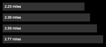
Here we just switched the selection to all divs on the page. We style the width using a function which multiples the miles datum by a factor of 120 pixels. and we set the text to “{x} miles”. Add a little CSS, and you get something like this:

Here’s a running example you can play with. Try changing the data values, or rendering it in a different way. Bar charts might not be the best way to represent a series of running times.
In tomorrow’s post I’ll go over animated transitions and possibly get into interaction. In the meantime, check out this slick D3-powered visualization of cloud providers from my friend Alex Wenckus at Cedexis.
Continue with the D3 Series:
Comments Off on Learning D3 Part 2: Enter and Exit

Update: I’m releasing a series of screencast tutorials on D3 at
deveo.tv. Check it out and let me know what you think!
I thought I’d take a stab at learning D3, the JavaScript data visualization library. To start, I picked through some of the examples and tried the code running in my own browser.
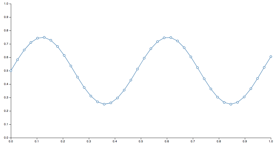
Once I played around with some of the code and saw a sine wave drawn on the screen, modified some values and saw the change, I thought “awesome!”. Then I went back to the website and the info started to actually click. Before I did that, when I tried to read the docs, my eyes just glazed over. If you’ve never played with it before, it might be the same for you. So best thing to do is, play around with the example code – change some numbers, refresh the page, then come back and read the docs afterwards.
D3 is not a high level library where you can feed it some data, and simply get back charts and graphs. Instead, it provides basic, composable building blocks for constructing visualizations.
So, D3 is built around some core principles. Admittedly, this is basically a shortened, cliff-notes regurgitation of some of the concepts outlined in the docs, restated for my own comprehension.
Selections
Selections are essentially the same as jQuery selectors, and defined by the W3C selectors API.
jQuery – select all paragraphs:
$('p')
D3 – select all paragraphs:
d3.selectAll('p')
In this way, D3 is declarative. Instead of manually finding and looping through arrays of DOM nodes, you specify what you want to operate on, then operate on the entire selection at once
Dynamic Properties
Styles, attributes, and other properties of the DOM can be specified as functions of data in D3, as opposed to simple constants.
Set the color style of all paragraphs to a simple value:
d3.selectAll("p").style("color", "white");
Set the color style of all paragraphs to alternating shades of gray:
  d3.selectAll("p").style("color", function(d, i) {
    return i % 2 ? "#fff" : "#eee";
  });
Bound Data
Dynamic, aka computed properties, often refer to data. The .data() method binds data to elements.
You might bind an array of numbers to list items. You can use these to compute dynamic font sizes
  d3.selectAll("li")
    .data([8, 4, 7, 12, 18])
    .style("font-size", function(d) { return d + "px"; });
I’ll continue tomorrow and start to build up some basic visuals with these components.
Continue with the D3 Series:
4 Comments
Lazy weekend day. Not a lot of computer time. I’ve been thinking about information products, and how it might be fun / challenging / educational to create an ebook or technical screencast site, and what the content plan for such a thing might look like.
Interesting Links
LispyScript: A JavaScript with macros. LispyScript is not a dialect of Lisp. There is no list processing in LispyScript. LispyScript is JavaScript using a Lispy syntax (tree structures). This is so the syntax tree can be manipulated while compiling in order to support macros.
The Important of Being Prolific: The value of working fast and shipping more, vs toiling slowly and perfecting a smaller body of work.
How to Get Guaranteed Results in Anything: Never ship. The results are guaranteed – nothing.
Exploring Everyday Things with R and Ruby. Explore a wide range of questions by learning how to assemble, process, simulate, and analyze the available data. Looks like a cool book.
Bloom Filters: A very cool interactive visualization and explanation of how bloom filters work.
Data Stories: A podcast on data visualization. Latest episode interviews Jeff Heer, creator of 4 data visualization toolkits, including D3.
Recline.JS: A simple but powerful library for building data applications in pure JavaScript and HTML.
Comments Off on Lazy weekend day
So today I ran the best distance yet – 2.59 miles in 25 minutes, controlling for time. This was the third run of the month. I actually experienced a “runners high” for the first time, felt like I could just keep going. I also love using the Nike+ iPhone app, it’s so much more motivating when your competing against your previous time and knowing you’re improving.
I just discovered an awesome app for tracking cycling, and racing courses vs other people called Strava, so I’m psyched to try that too.
Workwise – I also worked through adding features, refactoring, and adding tests to a couple existing rails apps for clients. Steady improvement. No progress on internal product work this week.
This afternoon I went for the second time to the bouldering gym for an hour and a half. Just tried it for the first time a couple weeks ago. It might be my new favorite thing – its exercise, but it’s like a puzzle, using your spatial reasoning to figure out how to get to the top. It sounds and looks easier than it is in reality. I slightly twisted my ankle as well! Feels better now though. That would be awesome, make a bet to run every other day for a month and immobilize myself. We have an alternate plan – if this happens the injured will meditate for an hour instead.
If it sounds like I’m phoning it in this time, it’s because I am! Literally writing this entry from my phone at a bar an hour before deadline. I’m happier with some of the entries from this week more than others. This weekend I’m going to content plan and start drafting early for next week, and hopefully generate something useful for the outside world.
Comments Off on And I Ran
So, over the weekend, I ordered a solid state drive (SSD) and a hard drive enclosure from OWC – Other World Computing. (This might be very uninteresting to others, and that’s fine, but I’m going to rant about it because I’m annoyed.) I ordered it 2 day air, assuming it would arrive on Tuesday. It arrived today, Thursday. 4 day air. Ok fine, whatever. When it arrived, I excitedly dug into the package, like the nerd that I am.
The purpose of this SSD is to extend the life of my Late 2008 model MacBook Pro, because although I’d love a retina display MBP, I’d rather wait for the 13-inch model, or a MacBook Air with a retina. So for now, I can squeeze some extra speed out of this old puppy by dropping an SSD into it. The purpose of the enclosure is to simply transfer the data from my old hard drive to the new one. The enclosure (OWC Express) was only $15. And it worked for about 5 minutes. You get what you pay for. With Mac OS X Lion you can’t use Disk Utility to restore from the boot partition while its running in normal mode. You have to go into “safe” mode. To do that, you must reboot. So after rebooting, the enclosure became defective, because I now consistently get a message from the machine that says “Because a USB device was drawing too much power from your computer, one or more of your USB devices has been enabled.”

If you do some searching around the internet, like I thoroughly did, you’ll get various suggestions like resetting the Mac’s SMC or PRAM. I did this repeatedly, to no effect. No amount of reboots will revive this enclosure. The iPhone still works when plugged in, so I know it’s not the ports on the machine. And apparently these enclosures are known for this. I just don’t understand why a company would sell a known-to-be-defective product as part of a “kit” to upgrade hard drives.
I contacted OWC’s chat-based tech support, and after receiving being greeted by a support technician, I gave a very detailed description of the problem and asked for help. The person I was chatting with never said another word for 10 minutes. I assumed our connection had been lost and ended chat, tried to reconnect, but never got reconnected with another support technician. So much for support!
I went to the local Best Buy and found a powered enclosure for $50. I decided to try to save money and find a cheaper one elsewhere. I went to Staples and found a nice employee there who actually lent me a cable for free that he thought would fix it – a split USB cable that draws power from one USB port and transfers data over another. Drove home, and the cable doesn’t work, of course. I was sure it wouldn’t, but decided to try it anyway. I also tried plugging it into a powered USB hub, no luck there either. I’m thinking the error message is erroneous and that either the enclosure and/or the drive itself is fried. Long story short, a waste of a Thursday night! Rest assured I’ll be returning the defective junk. Better luck tomorrow.
Comments Off on Solid Waste of Time
