Continuing my exploration of data visualization tools and principles, I've been going through Edward Tufte's classic book, "The Visual Display of Quantitative Information." Chapter 4 introduces the idea of Data-Ink, and the Data-Ink Ratio. "Data-Ink is the non-erasable core of a graphic, the non-redundant ink arranged in response to variation in the numbers presented." (Tufte, 1983) In other words, data-ink represents the data. Everything else, grid lines, grid ticks, labels, framing, is not the data. The Data-Ink Ratio is the proportion of ink devoted to data vs everything else. Tufte's core principle here is: "Above all else, show the data." The data should speak for itself as much as possible, and everything else should get out of the way. So that's pretty much common sense. What does it actually look like? Here's the first and last parts of an example put together by Tim Bray: 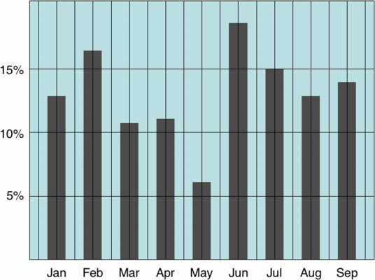 This version has lots of ink devoted to extraneous grid lines, background colors, framing, etc. Tim whittles it down to this:
 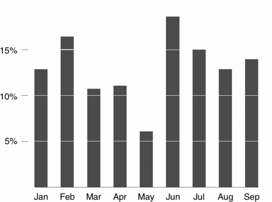 In this version, we lose the grid, the box framing it, the background color, and imply the horizontal scale lines by subtracting ink. It's a good idea to keep the data-ink ratio in mind when designing data graphics. Of course, it's an idea to be used in moderation. It's possible to go overboard. If you lose all of the grid and labeling, the viewer has no reference points, and the data becomes meaningless. Which do you think is better?