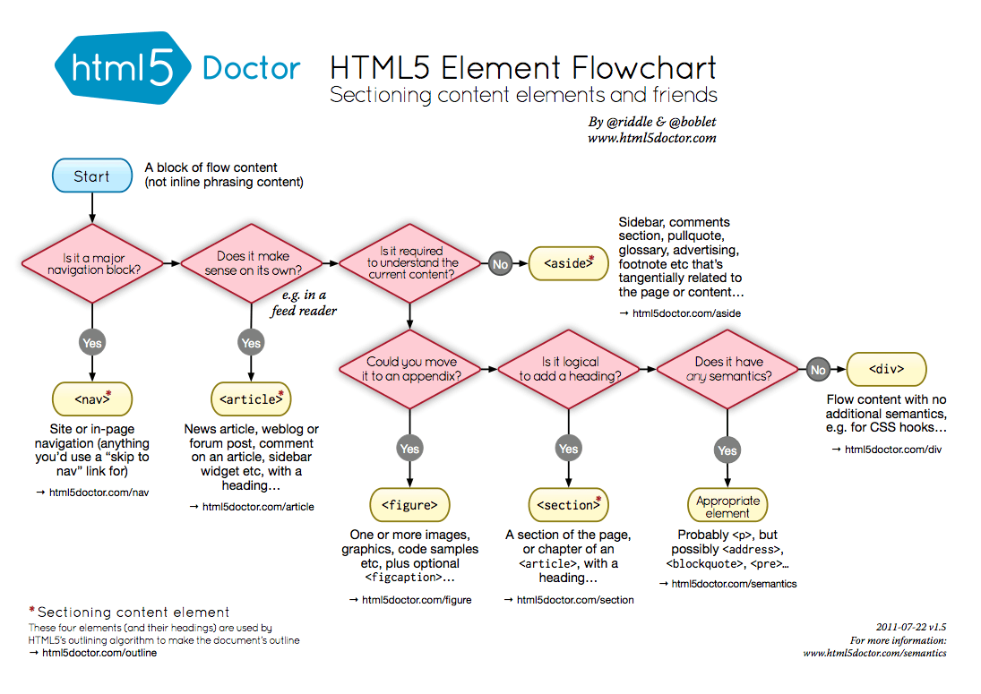
Ok, I put in a little more work into the new blog template tonight. If you're just joining, in the last entry I declared my intention to create a new, basic minimalist blog template for this site and live blog it. So, first I created an empty git repository and added a nearly blank readme file to it and threw it on Github. Next is the question of how much HTML5-specific tags to use in the markup. I looked at the source of a few of the minimalist templates out there. The source on Mike Bostock's blog is very HTML5. There is no head or body tags. Just the doctype, followed by a title tag, style and script tags, then right into content with HTML5 tags - header, aside, footer. Alex Payne's blog has the more traditional head and body tags, various links and meta tags, etc. It doesn't really seem to matter. Everyone got along fine before HTML5 tags. I guess they have more semantic meaning than plain divs with semantic classes. I found this handy HTML5 Element Flowchart, just in case you need help making these intense tag name decisions. Then I went back to the Twitter Bootstrap framework, because I like it's built in responsive design. I started with the appropriately named "starter template", which still isn't 100% minimal - it includes the ubiquitous top navigation bar that every lazy developer who uses Twitter Bootstrap fails to modify, so to start I just copied that file to index.html. 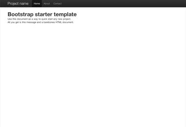 Next, since I'm building bootstrap from source (instructions), I compiled it with "make" and copied over the CSS and JS to an "assets" folder in my template project. Next was simply removing the top navigation bar, since I won't be using that on the blog. Then to make it more blog like, I put in some long form generic lorem ipsum text and headers, and made it more HTML5-y by adding header, article and footer tags. It didn't seem to make a difference to the look and feel, so why not.

Primary Header
By default, this template resizes as you scale the window up and down, which looks good as it gets smaller, but isn't very readable for a single column when the screen gets wide. With the chrome inspector pointed at the container element, you can see that depending on the width, different style rules start applying:
  @media (min-width: 1200px)
  @media (max-width: 979px) and (min-width: 768px)
  @media (max-width: 767px)
This is all coming from boostrap-responsive.css. Compiling from source actually turned out to be useful right away, because the LESS templates generate a lot of code for each of those layouts. You could remove them from the generated css file, but it would be a lot more code. With the LESS templates, you can comment out the wide layout in one line, and modify another and have it stop expanding beyond 768px wide:
diff --git a/less/responsive-768px-979px.less b/less/responsive-768px-979px.less
index 76f4f6d..7fa6dd0 100644
--- a/less/responsive-768px-979px.less
+++ b/less/responsive-768px-979px.less

-@media (min-width: 768px) and (max-width: 979px) {
+@media (min-width: 768px) {

diff --git a/less/responsive.less b/less/responsive.less
index 734b198..e8476ea 100644
--- a/less/responsive.less
+++ b/less/responsive.less
@@ -38,7 +38,7 @@
 @import "responsive-768px-979px.less";

 // Large desktops
-@import "responsive-1200px-min.less";
+// @import "responsive-1200px-min.less";
So far it looks like this. Yes, mind blowing. It's a good start though.