Ok, I put in a little more work into the new blog template tonight. If you’re just joining, in the last entry I declared my intention to create a new, basic minimalist blog template for this site and live blog it.
So, first I created an empty git repository and added a nearly blank readme file to it and threw it on Github.
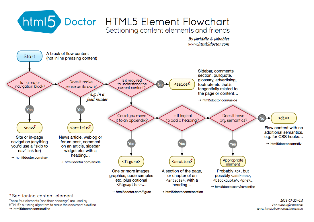
Next is the question of how much HTML5-specific tags to use in the markup. I looked at the source of a few of the minimalist templates out there. The source on Mike Bostock’s blog is very HTML5. There is no head or body tags. Just the doctype, followed by a title tag, style and script tags, then right into content with HTML5 tags – header, aside, footer. Alex Payne’s blog has the more traditional head and body tags, various links and meta tags, etc. It doesn’t really seem to matter. Everyone got along fine before HTML5 tags. I guess they have more semantic meaning than plain divs with semantic classes. I found this handy HTML5 Element Flowchart, just in case you need help making these intense tag name decisions.
Then I went back to the Twitter Bootstrap framework, because I like it’s built in responsive design. I started with the appropriately named “starter template“, which still isn’t 100% minimal – it includes the ubiquitous top navigation bar that every lazy developer who uses Twitter Bootstrap fails to modify, so to start I just copied that file to index.html.

Next, since I’m building bootstrap from source (instructions), I compiled it with “make” and copied over the CSS and JS to an “assets” folder in my template project. Next was simply removing the top navigation bar, since I won’t be using that on the blog. Then to make it more blog like, I put in some long form generic lorem ipsum text and headers, and made it more HTML5-y by adding header, article and footer tags. It didn’t seem to make a difference to the look and feel, so why not.
-
-
-
+
+
+
By default, this template resizes as you scale the window up and down, which looks good as it gets smaller, but isn’t very readable for a single column when the screen gets wide. With the chrome inspector pointed at the container element, you can see that depending on the width, different style rules start applying:
@media (min-width: 1200px)
@media (max-width: 979px) and (min-width: 768px)
@media (max-width: 767px)
This is all coming from boostrap-responsive.css. Compiling from source actually turned out to be useful right away, because the LESS templates generate a lot of code for each of those layouts. You could remove them from the generated css file, but it would be a lot more code. With the LESS templates, you can comment out the wide layout in one line, and modify another and have it stop expanding beyond 768px wide:
diff --git a/less/responsive-768px-979px.less b/less/responsive-768px-979px.less
index 76f4f6d..7fa6dd0 100644
--- a/less/responsive-768px-979px.less
+++ b/less/responsive-768px-979px.less
-@media (min-width: 768px) and (max-width: 979px) {
+@media (min-width: 768px) {
diff --git a/less/responsive.less b/less/responsive.less
index 734b198..e8476ea 100644
--- a/less/responsive.less
+++ b/less/responsive.less
@@ -38,7 +38,7 @@
@import "responsive-768px-979px.less";
// Large desktops
-@import "responsive-1200px-min.less";
+// @import "responsive-1200px-min.less";
So far it looks like this. Yes, mind blowing. It’s a good start though.
Comments Off on Minimalist blog template progression
I’ve been meaning to create a new template for this blog. That’s probably not relavant for those of you who read this in a feed reader, it’s more for myself, because I actually look at this thing. I also like reading blogs on their actual sites as opposed to feed readers. I can’t be the only one. The current template is a built-in WordPress theme, and while it’s nice enough, it’s become totally generic and boring to my eyes. It’s also not-invented-here, and we can’t have that, now can we? Well we can, somewhat. I could go full static-blog-generator, use Github pages, or create a brand new blog engine, but WordPress works fine. It has lots of plugins that do everything under the sun. This is just about look and feel.
Another good reason for creating a new template – it’s always good to practice the basics. Like the idea of kata in martial arts, if you continually practice patterns of movement, they become engrained in muscle memory and you’re able to perform them flawlessly without thinking. Or so the theory goes. Master the basics.
Creating the template involves two basic steps: creating the static HTML, and then converting it into a wordpress theme by breaking it into multiple PHP files, adding tags for outputting posts, comments, etc. For the next few blog entries, perhaps I’ll just live-blog the process.
So, first thing to do is decide what it’s going to look like. In the words of Edward Tufte and as mentioned here previously, “above all else, show the data.” In other words, it should be minimal. It should be easy to read. It should get out of the way. Something along the lines of Alex Payne and Mike Bostock‘s blogs, or Gist.io. A clean, uncluttered, single column of text. 13-14pt font size. Lots of white space.
Next, is deciding what, if any pre-existing tools to use to build it. The Twitter Bootstrap framework is nice because you can put together something decent-looking in a relatively short period of time. I’m not looking to reinvent the CSS framework wheel, so I’ll go with that. Only downside is including a lot of CSS I won’t be using, but that can be trimmed down. One bonus is the built in responsive-design support, so things look readable on mobile, and you don’t end up with microscopic text and need to zoom, which is what I’ve got going on now.
There’s a few ways to use Bootstrap. In the past when, I’ve just downloaded the current zip file and copied the precompiled CSS into my projects. That works and gets you up and running with something in a couple minutes. It’s also possible to customize it online and download the result. Or for ultimate flexibility, you can clone the full git repository, then customize and compile the CSS at the source level. I’m going to go the third route this time, because I’m just curious. Maybe I won’t need it. We’ll see tomorrow…
Comments Off on Creating a minimalist blog template
A long overdue update of AssetPackager is finally here:
- Rails 2.2 compatibility fixes
- Packages generated on demand in production mode. Running the asset:packager:build_all rake task no longer necessary.
- Now compatible with Git, and any other revision control system since revision numbers are no longer used.
- No more mucking with internal Rails functions, which means:
- Return to use of query-string timestamps. Greatly simplifies things.
- Multiple asset-hosts supported
- Filenames with ”.”’s in them, such as “jquery-x.x.x” are supported.
Get the latest at http://github.com/sbecker/asset_packager
Thanks to the many forkers for ideas and solutions.
Comments Off on AssetPackager update
Asset Packager has been released! (Formerly known as MergeJS) New features include:
- support for css files
- versioning of individual packages
- use of more meaningful subversion revision numbers (if available) (thanks Chris Van Pelt!)
- namespaced rake tasks
- no more revision numbers in the yaml file
- lotsa refactoring
- unit tests
- more intuitive names for everything!
Go here to check it out: AssetPackager
Comments Off on AssetPackager released!
