I’ve been heads down working on a small, simple software app that is super simple but potentially pretty useful to individuals working within companies with more than a handful of employees. I’m finally getting close to finishing the first release.
I mentioned the idea to a friend one day last fall and he said “Yes! You should do it!” so I suspended work on the other side project I was working on and jumped right on it, since it would be super quick. I’d get it out there and be back to work on my other side project. Funny how that works.
The initial proof of concept was done in a couple days – you could get the idea of how it would work, but it was just a fake out. All that was left was to make it real. Simple, right? I kept at it for two weeks, then left for a three week trip, which brought progress to a halt. Once I got back from the trip, it was the holiday season and I needed to focus on billable work in December to make up for being gone. Finally in January I picked it back up. What initially seemed like something that could be done in a month has stretched into a few, but it’s so close.
Game Mechanics
The app is actually a game, which is my first foray into building something intended to be “played” – to be fun and challenging. Designing a game is super interesting, it’s almost like playing a game in itself, and eventually once you’ve built enough of it, you are indeed playing the game. Implementing game mechanics like scoring points, playing rounds, and thinking about how to make something fun and challenging vs. efficient and useful is super enlightening. The best part is that this app sits in the middle – it’s fun, but also useful and repeated play gives you real value in your actual life.
1 Comment
Ok, I put in a little more work into the new blog template tonight. If you’re just joining, in the last entry I declared my intention to create a new, basic minimalist blog template for this site and live blog it.
So, first I created an empty git repository and added a nearly blank readme file to it and threw it on Github.
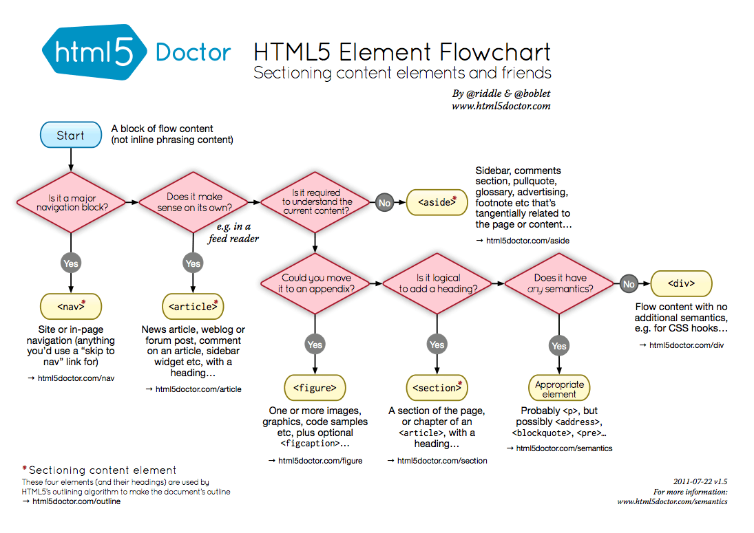
Next is the question of how much HTML5-specific tags to use in the markup. I looked at the source of a few of the minimalist templates out there. The source on Mike Bostock’s blog is very HTML5. There is no head or body tags. Just the doctype, followed by a title tag, style and script tags, then right into content with HTML5 tags – header, aside, footer. Alex Payne’s blog has the more traditional head and body tags, various links and meta tags, etc. It doesn’t really seem to matter. Everyone got along fine before HTML5 tags. I guess they have more semantic meaning than plain divs with semantic classes. I found this handy HTML5 Element Flowchart, just in case you need help making these intense tag name decisions.
Then I went back to the Twitter Bootstrap framework, because I like it’s built in responsive design. I started with the appropriately named “starter template“, which still isn’t 100% minimal – it includes the ubiquitous top navigation bar that every lazy developer who uses Twitter Bootstrap fails to modify, so to start I just copied that file to index.html.

Next, since I’m building bootstrap from source (instructions), I compiled it with “make” and copied over the CSS and JS to an “assets” folder in my template project. Next was simply removing the top navigation bar, since I won’t be using that on the blog. Then to make it more blog like, I put in some long form generic lorem ipsum text and headers, and made it more HTML5-y by adding header, article and footer tags. It didn’t seem to make a difference to the look and feel, so why not.
-
-
-
+
+
+
By default, this template resizes as you scale the window up and down, which looks good as it gets smaller, but isn’t very readable for a single column when the screen gets wide. With the chrome inspector pointed at the container element, you can see that depending on the width, different style rules start applying:
@media (min-width: 1200px)
@media (max-width: 979px) and (min-width: 768px)
@media (max-width: 767px)
This is all coming from boostrap-responsive.css. Compiling from source actually turned out to be useful right away, because the LESS templates generate a lot of code for each of those layouts. You could remove them from the generated css file, but it would be a lot more code. With the LESS templates, you can comment out the wide layout in one line, and modify another and have it stop expanding beyond 768px wide:
diff --git a/less/responsive-768px-979px.less b/less/responsive-768px-979px.less
index 76f4f6d..7fa6dd0 100644
--- a/less/responsive-768px-979px.less
+++ b/less/responsive-768px-979px.less
-@media (min-width: 768px) and (max-width: 979px) {
+@media (min-width: 768px) {
diff --git a/less/responsive.less b/less/responsive.less
index 734b198..e8476ea 100644
--- a/less/responsive.less
+++ b/less/responsive.less
@@ -38,7 +38,7 @@
@import "responsive-768px-979px.less";
// Large desktops
-@import "responsive-1200px-min.less";
+// @import "responsive-1200px-min.less";
So far it looks like this. Yes, mind blowing. It’s a good start though.
Comments Off on Minimalist blog template progression
I’ve been meaning to create a new template for this blog. That’s probably not relavant for those of you who read this in a feed reader, it’s more for myself, because I actually look at this thing. I also like reading blogs on their actual sites as opposed to feed readers. I can’t be the only one. The current template is a built-in WordPress theme, and while it’s nice enough, it’s become totally generic and boring to my eyes. It’s also not-invented-here, and we can’t have that, now can we? Well we can, somewhat. I could go full static-blog-generator, use Github pages, or create a brand new blog engine, but WordPress works fine. It has lots of plugins that do everything under the sun. This is just about look and feel.
Another good reason for creating a new template – it’s always good to practice the basics. Like the idea of kata in martial arts, if you continually practice patterns of movement, they become engrained in muscle memory and you’re able to perform them flawlessly without thinking. Or so the theory goes. Master the basics.
Creating the template involves two basic steps: creating the static HTML, and then converting it into a wordpress theme by breaking it into multiple PHP files, adding tags for outputting posts, comments, etc. For the next few blog entries, perhaps I’ll just live-blog the process.
So, first thing to do is decide what it’s going to look like. In the words of Edward Tufte and as mentioned here previously, “above all else, show the data.” In other words, it should be minimal. It should be easy to read. It should get out of the way. Something along the lines of Alex Payne and Mike Bostock‘s blogs, or Gist.io. A clean, uncluttered, single column of text. 13-14pt font size. Lots of white space.
Next, is deciding what, if any pre-existing tools to use to build it. The Twitter Bootstrap framework is nice because you can put together something decent-looking in a relatively short period of time. I’m not looking to reinvent the CSS framework wheel, so I’ll go with that. Only downside is including a lot of CSS I won’t be using, but that can be trimmed down. One bonus is the built in responsive-design support, so things look readable on mobile, and you don’t end up with microscopic text and need to zoom, which is what I’ve got going on now.
There’s a few ways to use Bootstrap. In the past when, I’ve just downloaded the current zip file and copied the precompiled CSS into my projects. That works and gets you up and running with something in a couple minutes. It’s also possible to customize it online and download the result. Or for ultimate flexibility, you can clone the full git repository, then customize and compile the CSS at the source level. I’m going to go the third route this time, because I’m just curious. Maybe I won’t need it. We’ll see tomorrow…
Comments Off on Creating a minimalist blog template
Update: I’m releasing a series of screencast tutorials on D3 at
deveo.tv. Check it out and let me know what you think!

Choropleths are maps that indicate variations in data using different shades of color. Turns out you can easily build these using something like D3. How does that work?
// create a geo path - https://github.com/mbostock/d3/wiki/Geo-Paths
var path = d3.geo.path();
// create an svg element
var svg = d3.select("#chart")
.append("svg");
// create a container for counties
var counties = svg.append("g")
.attr("id", "counties")
.attr("class", "Blues");
// create a container for states
var states = svg.append("g")
.attr("id", "states");
// load the county shape data
d3.json("../data/us-counties.json", function(json) {
// create paths for each county using the json data
// and the geo path generator to draw the shapes
counties.selectAll("path")
.data(json.features)
.enter().append("path")
.attr("class", data ? quantize : null)
.attr("d", path);
});
// load the state shape data
d3.json("../data/us-states.json", function(json) {
// create paths for each state using the json data
// and the geo path generator to draw the shapes
states.selectAll("path")
.data(json.features)
.enter().append("path")
.attr("d", path);
});
// load the unemployment by county data
d3.json("unemployment.json", function(json) {
data = json;
// for each county, set the css class using the quantize function
// (an external CSS file contains the css classes for each color in the scheme)
counties.selectAll("path")
.attr("class", quantize);
});
// quantize function takes a data point and returns a number
// between 0 and 8, to indicate intensity, the prepends a 'q'
// and appends '-9'
function quantize(d) {
return "q" + Math.min(8, ~~(data[d.id] * 9 / 12)) + "-9";
}
And the CSS classes for each shade of blue:
.Blues .q0-9{fill:rgb(247,251,255)}
.Blues .q1-9{fill:rgb(222,235,247)}
.Blues .q2-9{fill:rgb(198,219,239)}
.Blues .q3-9{fill:rgb(158,202,225)}
.Blues .q4-9{fill:rgb(107,174,214)}
.Blues .q5-9{fill:rgb(66,146,198)}
.Blues .q6-9{fill:rgb(33,113,181)}
.Blues .q7-9{fill:rgb(8,81,156)}
.Blues .q8-9{fill:rgb(8,48,107)}
Continue with the D3 Series:
4 Comments
A List Apart is conducting their annual web designer survey:

Comments Off on A List Apart’s Web Design Survey
I’m back from Austin. This was my first SXSW, but probably not the last. Four days of total immersion with web professionals and super stars from all over the world can start to distort reality. But it was very inspiring! I’m full of new ideas and ambitions. One mantra from the conference to remember – ideas are 1%, execution is 99%.
At any given time, 1/3rd of the attendees were gazing into their laptop screen, usually a Mac powerbook. I guess I’ll soon be joining this world minority/design majority. I’m kinda glad I didn’t have mine during the sessions. The attendees that did were often surfing the web and reading OTHER blogs rather than paying attention! It would have helped to take more notes though – my hand is forgetting how to write manually. Many people were taking notes directly into their blogs, so I’m sure multiple outlines of every session already exists on the net some where.
Networkers paradise: I met a lot of cool people – some of the blogging elite, some who don’t blog, some old friends, and more.
Comments Off on SXSW Post-Mortem
I usually read blogs from Bloglines, so everything tends to look the same. Lame. What a shame. Too bad bloglines doesn’t let you read each blog in the design the author intended.
I just updated my blog’s sidebar with a list of my randomly favorite blogs. (Leaving out still a bunch of others I check out just because I don’t want the list to scroll forever.) Clicking around, I noticed that a couple of them have recently re-designed! Check out the fresh looks at:
- encytemedia – these tones of green are among my favorite colors. love the icons. but that blue line in the header slightly irks me.
- whitespace – so nice. giant comment numbers! and when you click to read a full entry, the article appears in the left column and the comments appear in the right, awesome idea.
Comments Off on Escaping Bloglines and the Sea of Same-ness
Originally seen at Needmore Notes, here’s 11 Tips to surviving a day job with your creativity intact . Creativity is a muscle that needs exercise just like any other, or you will become weak. This article has ideas that will inspire and show you how to make time for your creative side.
The article reminded me of The Creative Habit by Twyla Tharp, another great book on creativity.
Speaking of which, I’d really like to bust out an original design for this blog sometime in the near future.
Comments Off on Creative ideas for staying creative
