Update: I’m releasing a series of screencast tutorials on D3 at
deveo.tv. Check it out and let me know what you think!

Choropleths are maps that indicate variations in data using different shades of color. Turns out you can easily build these using something like D3. How does that work?
// create a geo path - https://github.com/mbostock/d3/wiki/Geo-Paths
var path = d3.geo.path();

// create an svg element
var svg = d3.select("#chart")
  .append("svg");

// create a container for counties
var counties = svg.append("g")
    .attr("id", "counties")
    .attr("class", "Blues");

// create a container for states
var states = svg.append("g")
    .attr("id", "states");

// load the county shape data
d3.json("../data/us-counties.json", function(json) {
  // create paths for each county using the json data
  // and the geo path generator to draw the shapes
  counties.selectAll("path")
      .data(json.features)
    .enter().append("path")
      .attr("class", data ? quantize : null)
      .attr("d", path);
});

// load the state shape data
d3.json("../data/us-states.json", function(json) {
  // create paths for each state using the json data
  // and the geo path generator to draw the shapes
  states.selectAll("path")
      .data(json.features)
    .enter().append("path")
      .attr("d", path);
});

// load the unemployment by county data
d3.json("unemployment.json", function(json) {
  data = json;

  // for each county, set the css class using the quantize function
  // (an external CSS file contains the css classes for each color in the scheme)
  counties.selectAll("path")
      .attr("class", quantize);
});

// quantize function takes a data point and returns a number
// between 0 and 8, to indicate intensity, the prepends a 'q'
// and appends '-9'
function quantize(d) {
  return "q" + Math.min(8, ~~(data[d.id] * 9 / 12)) + "-9";
}
And the CSS classes for each shade of blue:
.Blues .q0-9{fill:rgb(247,251,255)}
.Blues .q1-9{fill:rgb(222,235,247)}
.Blues .q2-9{fill:rgb(198,219,239)}
.Blues .q3-9{fill:rgb(158,202,225)}
.Blues .q4-9{fill:rgb(107,174,214)}
.Blues .q5-9{fill:rgb(66,146,198)}
.Blues .q6-9{fill:rgb(33,113,181)}
.Blues .q7-9{fill:rgb(8,81,156)}
.Blues .q8-9{fill:rgb(8,48,107)}
Continue with the D3 Series:
4 Comments
Some links to things I’ve been thinking about / working on lately:
Choropleth Maps: These are maps with color shaded regions for indicating things like which way states went in presidential elections, population density, per capita income, etc. I’m working on making these with D3 (cool example), and will probably post on it soon. Someone else already did.
Paper Trail: I have multiple projects needing some kind of versioning of data right now. There’s lots of ways to do this. You can roll your own, or you can use an open source project with a lot of the edge cases thought out. Papertrail is a versioning gem for Rails projects. It’s quite extensive and lets you do things like undo changes.
Protocolist: Somewhat related to the above, are activity feeds. Track who did what when in your app.
Tabletop.js: This lets you pull data in to web pages from external Google Spreadsheet documents. Could be useful for ad-hoc dataviz stuff, or just general mashup stuff.
Comments Off on Maps, tracking changes, mashing up data
Update: I’m releasing a series of screencast tutorials on D3 at
deveo.tv. Check it out and let me know what you think!
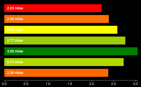
In Learning D3 Part 5, I waxed poetic about D3’s functions for drawing axis lines and labels. This time I’ll talk about scales. Here’s a pretty graph to go with it. This is similar to the earlier examples, but now drawn with SVG, using axes and scales. Ooh la la.

What are scales?
According to the ol’ wikipedia, a scale is “a graduated range of values forming a standard system for measuring or grading something”. In D3 though, scales are functions. “Functions that map from an input domain to an output range”.
In other words, scales are what tell you how many pixels high a bar chart should be with a value of 1 vs 5 vs 7. If you wanted to draw a very tiny bar chart, you could just use those values, and draw bars that are only 1, 5, and 7 pixels high. But if you really want to make your point, you’d probably do better drawing bigger bars.
D3 has some built in scales you can use for convenience. The most common type of scale in D3 is the linear scale.
linear: arranged in or extending along a straight or nearly straight line
scale: a graduated range of values forming a standard system for measuring or grading something
So a linear scale is a scale which the output value increases or decreases in constant proportion to the input value.
The simplest possible scale is a 1:1 scale.
var scale = d3.scale.linear();

scale(1) // 1
scale(2) // 2
Domain
The domain is the range of possible input values in the scale. So I have a series of distances [2.23, 2.39, 2.59, 2.77, 3.05] I might want the domain to range from 0 to 4 or so, to capture the complete range of input values.
Range
The range is the range (again) of possible output values in the scale. Your output values might be in pixels. If you have a 400 pixel wide graph, you’d want to have a range on the x-axis from 0 to 400.
So, just remember domain means input, range means output.
Say we want to draw a very tall bar chart. We might want each input unit to equate to 100 pixels in height. So we’d need a 1:100 scale. Our input values range from 0 to 10, so thats our domain, and our graph is 1000 pixels tall, to accomodate these giant bars, so our output values range from 0 to 1000.
var scale = d3.scale.linear()
  .domain([0, 10])
  .range([0,1000]);

scale(0) // 0
scale(1) // 100
scale(2) // 200
You can also invert them. This is how you get 0 on the bottom of the Y axis with SVG.
var scale = d3.scale.linear()
  .domain([0, 10])
  .range([1000,1]);

scale(0) // 1000 - for the y axis, all the way at the bottom
scale(1) // 900 - a little higher
scale(2) // 800 - even higher now
Linear scales are pretty flexible. You can even use them to create color gradients:
var color = d3.scale.linear()
    .domain([-1, 0, 1])
    .range(["red", "white", "green"]);

color(-1)   // "#ff0000" red
color(-0.5) // "#ff8080" pinkish
color(0)    // "#ffffff" white
color(0.5)  // "#80c080" getting greener
color(0.7)  // "#4da64d" almost there..
color(1)    // "#008000" totally green!
This is a polylinear scale (aka multiple linear scales in one) lifted straight out of the API docs. The input domain from -1 to 0 maps from red to white, and from 0 to 1 maps from white to green. How cool is that? It calculates the color transitions for you.
Other Kinds of Scales
It doesn’t stop at linear. Oh no. So many more to choose from.
identity: a special kind of linear scale, 1:1, good for pixel values. input == output
power and logarithmic scales: sqrt, pow, log – for exponentially increasing values
quantize and quantile scales: for discrete sets of unique possible values for inputs or outputs
ordinal: for non quantitative scales, like names, categories, etc.
Here’s a running example of the graph at the top. I promise to do something other than bar charts of running distances next time. If you need more excitement right now, here’s a randomly generated, animated donut chart. So crazy.
Bonus question – what’s the redundant, non data-ink on the first chart?
Continue with the D3 Series:
1 Comment
Update: I’m releasing a series of screencast tutorials on D3 at
deveo.tv. Check it out and let me know what you think!
In Learning D3 Part 3, I went over how to add some basic animation and interactivity. This time I’ll go over a big component of D3 and other javascript visualization tools – SVG or Scalable Vector Graphics.
Scalable Vector Graphics
SVG is an XML based, 2 dimensional open-standard that’s been around since 1999. Since SVG graphics are vector based, they can be zoomed or scaled to any resolution without quality loss.
What can you do with it? SVG has a lot of functionality: paths, basic shapes, vertical text, text on a curve, gradient fills, masks, etc.
Canvas
Another tool for adding visuals to the web is the recently added HTML5 Canvas element. SVG and Canvas are not the same thing. Whereas SVG is vector based, Canvas uses raster graphics. SVG elements remain live and addressable in a scene graph (the DOM) after they’ve been rendered to the screen, so you can update them after rendering. Canvas uses a procedural approach – rather than declaring elements with XML, commands are only executed via scripts. In canvas, once an object has been drawn to the screen, it’s forgotten. If you need to move that object, you need to re-render the entire scene.
SVG in D3
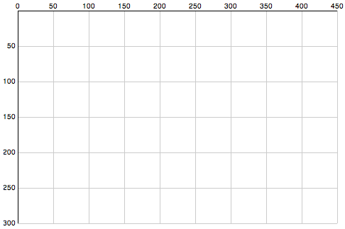
So to get started – we need to learn some more basics of SVG. The axis starts in the top left corner of a root SVG element and counts up as you move down and towards the right. If you have a 500×500 region, the point [0,0] is in the upper left, and [500,500] is in the bottom right.
Here’s a chart to illustrate SVG’s coordinate space, followed by the code to draw the chart.

Now the code:
// Define linear scales representing the pixel dimensions
var x = d3.scale.linear()
    .domain([0, 450])
    .range([0, 450]);

var y = d3.scale.linear()
     .domain([0,300])
     .range([0, 300]);

// define an SVG element to hold our chart
var chart = d3.select("body").append("svg")
    .attr("class", "chart")
    .attr("width", 490) // more space to accomodate our axis labels
    .attr("height", 320) // moar space!
  .append("g")
    .attr("transform", "translate(20,15)"); // move base coordinates over/down a bit so lines start at 0,0

// draw the X grid lines
chart.selectAll("line.x")
    .data(x.ticks(10))
  .enter().append("line")
    .attr("class", "x")
    .attr("x1", x)
    .attr("x2", x)
    .attr("y1", 0)
    .attr("y2", 300)
    .style("stroke", "#ccc");

// draw the Y axis grid lines
chart.selectAll("line.y")
    .data(y.ticks(10))
  .enter().append("line")
    .attr("class", "y")
    .attr("x1", 0)
    .attr("x2", 450)
    .attr("y1", y)
    .attr("y2", y)
    .style("stroke", "#ccc");

// add the X axis labels
chart.selectAll(".rule")
    .data(x.ticks(10))
  .enter().append("text")
    .attr("x", x)
    .attr("y", 0)
    .attr("dy", -3)
    .attr("text-anchor", "middle")
    .text(String);

// add the Y axis labels
chart.selectAll(".rule")
    .data(y.ticks(10))
  .enter().append("text")
    .attr("x", 0)
    .attr("y", y)
    .attr("dy", 3) // shift down slightly
    .attr("dx", -3)  // and to the left
    .attr("text-anchor", "end") // align right
    .text(function(d) { return d == 0 ? '' : d;});

// add the darker X axis line
chart.append("line")
    .attr("x1", 0)
    .attr("x2", 450)
    .style("stroke", "#000");

// add the darker Y axis line
chart.append("line")
    .attr("y1", 0)
    .attr("y2", 300)
    .style("stroke", "#000");
That’s a bit long, eh? Here is the whole example. D3 actually has more convenient functions for drawing axis lines, I’ll leave those for another time. That’s all for tonight!
Continue with the D3 Series:
Comments Off on Learning D3 Part 4: Intro to SVG Graphics
Update: I’m releasing a series of screencast tutorials on D3 at
deveo.tv. Check it out and let me know what you think!

In Learning D3 Part 2, I went over how to bind datasets to the DOM, and get elements on and off the page with enter and exit sub-selections. This time I’ll go over how to add some basic animation and interaction.
Transitions
You specify animations (or other transitions) with the .transition() method, followed by a chain describing the end result. This can include any DOM transformation, such as updates to the width or background color. D3 conveniently calculates the “tween” values for distances and colors, which saves a huge amount of time. You just worry about the values to transition from and to, the duration of the animation, and any delay that should happen before the animation starts.
If you’re drawing a horizontal bar chart of running distances, it might help to convey distance a bit more by animating the growth of each bar horizontally.
var distances = [2.23, 2.39, 2.59, 2.77, 3.05];

d3.select('body').selectAll('div')
  .data(distances)
  .enter()
  .append('div')
  .html('.')
  .style('width', '10px')
  .style('opacity', 0)
  .transition()
    .delay(function(d, i) { return i * 1000 })
    .duration(1000)
    .style('width', function(d) { return (d * 150) + 'px'; })
    .style('opacity', 1)
    .text(function(d) { return d + ' miles'; });
I’m throwing in a few things at once. See it run here. What’s happening? A div is appended for each distance, and initially set to a small width of 10px, the text of “.” and an opacity of 0. It’s invisible! But only for a moment. Then we set up the transition. Each item is delayed 1 second later than the previous using a function returning a multiple of the item index. The duration is set to 1 second with .duration(1000). With this combo, each bar appears in succession. The rest is familiar, setting the full width, label text, and full opacity.
Interaction
Now let’s add some basic user interaction to it, by highlighting the current run when you mouse over it.
var distances = [2.23, 2.39, 2.59, 2.77, 3.05];

d3.select('body').selectAll('div')
  .data(distances)
  .enter()
    .append('div')
    .html('...')
    .style('width', '10px')
    .style('opacity', 0)
    .on("mouseover", function(){
      d3.select(this).transition().duration(300)
        .style("background-color", "#FFD700");
    })
    .on("mouseout", function(){
      d3.select(this).transition().duration(300)
        .style("background-color", "#333");
    })
    .transition()
      .delay(function(d, i) { return i * 300 })
      .duration(300)
      .style('width', function(d) { return (d * 150) + 'px'; })
      .style('opacity', 1)
      .text(function(d) { return d + ' miles'; });
Here’s the running example. Notice the .on(“mouseover”) and .on(“mouseout”) events, describing another transition/animation to fade the background color to yellow and back. The events pass the current context as “this”, which you can again select with d3.select() and apply transitions to.
That’s the basic idea. These basic building blocks are all you really need to build up complex visualizations. I haven’t touched on SVG yet, so that’ll be up next.
Continue with the D3 Series:
3 Comments
Update: I’m releasing a series of screencast tutorials on D3 at
deveo.tv. Check it out and let me know what you think!
In Learning D3, Part 1 I went over some basic concepts of D3 – selections, dynamic properties, and bound data. I’m going to pick back up with data binding, and discuss how new data gets on the page.
Enter and Exit
Let’s say you have some data. It’s in the form of an array of numbers. Each of the numbers represent something, perhaps it’s the number of miles you ran each time you’ve gone for a run so far this month:
var distances = [2.23, 2.39, 2.59, 2.77];
So we have four distances. In our first go at this, we’ll bind these to all the paragraphs on the page.
d3.selectAll('p')
  .data(distances);
If we have some paragraphs already in the document, then great, we can go about updating them to represent our data.
d3.selectAll('p')
  .data(distances)
  .text(String) // set the paragraph text to the data values
This is simply passing String as a callback function to text(). String will be called for each of the data items or “datums”. The value returned (the number, converted to a string) is rendered as the text node of the element.
But lets say to begin with, we just have a blank page, with no paragraphs. How do we get new paragraphs on the page, representing the data? Enter .enter(). When we call enter() on an existing selection, we switch to a sub-selection representing the data that is yet to be mapped to an element, because there is not yet enough of them on the page to represent all of the current dataset. In other words, if there are more datums in our dataset than elements on the page, the “enter” sub-selection represents the yet-to-be-added elements.
d3.selectAll('p')
  .data(distances)
  .text(String)
  .enter() // switch to yet-to-be-added elements selection
Following .enter(), we declare how these elements should come into being. Should they appended at the end of the current selection, or inserted at the beginning? In most cases, probably append. Also notice I added .select(‘body’) before selecting all paragraphs. This is there because we need a parent element to append new elements within.
d3.select('body').selectAll('p')
  .data(distances)
  .text(String)
  .enter()
    .append('p') // append a paragraph node for each new datum
    .text(String); // and set its text value
Now, new paragraph elements will be rendered for all datums which don’t yet have a matching paragraph element. D3 also supports the reverse, handling how to remove extra DOM nodes that no longer are needed to represent the entire dataset. In order to do this, you must first set the overall selection to a variable, then call enter and exit on it separately.
// Update existing paragraphs
var p = d3.select('body').selectAll('p')
         .data(distances)
         .text(String);

// Add any new paragraphs needed
p.enter()
  .append('p')
  .text(String);

// Remove any paragraphs no longer needed
p.exit()
  .remove();
That works, but it’s not much to look at. How easy would it be to convert it into a bar chart? Pretty simple:
  d3.select('body').selectAll('div')
    .data(distances)
    .enter()
      .append('div')
      .style('width', function(d) { return (d * 120) + 'px'; })
      .text(function(d) { return d + ' miles'; });
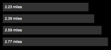
Here we just switched the selection to all divs on the page. We style the width using a function which multiples the miles datum by a factor of 120 pixels. and we set the text to “{x} miles”. Add a little CSS, and you get something like this:

Here’s a running example you can play with. Try changing the data values, or rendering it in a different way. Bar charts might not be the best way to represent a series of running times.
In tomorrow’s post I’ll go over animated transitions and possibly get into interaction. In the meantime, check out this slick D3-powered visualization of cloud providers from my friend Alex Wenckus at Cedexis.
Continue with the D3 Series:
Comments Off on Learning D3 Part 2: Enter and Exit

Update: I’m releasing a series of screencast tutorials on D3 at
deveo.tv. Check it out and let me know what you think!
I thought I’d take a stab at learning D3, the JavaScript data visualization library. To start, I picked through some of the examples and tried the code running in my own browser.
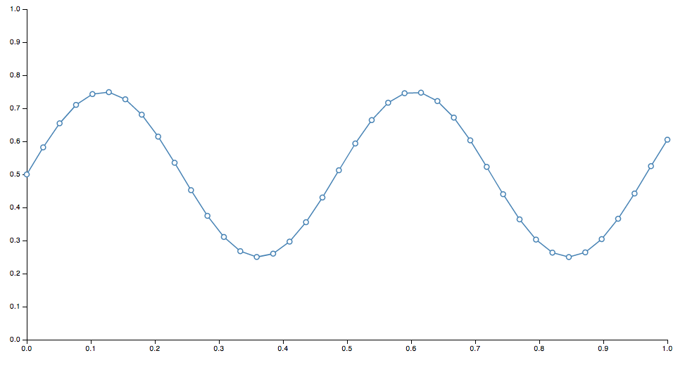
Once I played around with some of the code and saw a sine wave drawn on the screen, modified some values and saw the change, I thought “awesome!”. Then I went back to the website and the info started to actually click. Before I did that, when I tried to read the docs, my eyes just glazed over. If you’ve never played with it before, it might be the same for you. So best thing to do is, play around with the example code – change some numbers, refresh the page, then come back and read the docs afterwards.
D3 is not a high level library where you can feed it some data, and simply get back charts and graphs. Instead, it provides basic, composable building blocks for constructing visualizations.
So, D3 is built around some core principles. Admittedly, this is basically a shortened, cliff-notes regurgitation of some of the concepts outlined in the docs, restated for my own comprehension.
Selections
Selections are essentially the same as jQuery selectors, and defined by the W3C selectors API.
jQuery – select all paragraphs:
$('p')
D3 – select all paragraphs:
d3.selectAll('p')
In this way, D3 is declarative. Instead of manually finding and looping through arrays of DOM nodes, you specify what you want to operate on, then operate on the entire selection at once
Dynamic Properties
Styles, attributes, and other properties of the DOM can be specified as functions of data in D3, as opposed to simple constants.
Set the color style of all paragraphs to a simple value:
d3.selectAll("p").style("color", "white");
Set the color style of all paragraphs to alternating shades of gray:
  d3.selectAll("p").style("color", function(d, i) {
    return i % 2 ? "#fff" : "#eee";
  });
Bound Data
Dynamic, aka computed properties, often refer to data. The .data() method binds data to elements.
You might bind an array of numbers to list items. You can use these to compute dynamic font sizes
  d3.selectAll("li")
    .data([8, 4, 7, 12, 18])
    .style("font-size", function(d) { return d + "px"; });
I’ll continue tomorrow and start to build up some basic visuals with these components.
Continue with the D3 Series:
4 Comments
A long overdue update of AssetPackager is finally here:
- Rails 2.2 compatibility fixes
- Packages generated on demand in production mode. Running the asset:packager:build_all rake task no longer necessary.
- Now compatible with Git, and any other revision control system since revision numbers are no longer used.
- No more mucking with internal Rails functions, which means:
- Return to use of query-string timestamps. Greatly simplifies things.
- Multiple asset-hosts supported
- Filenames with ”.”’s in them, such as “jquery-x.x.x” are supported.
Get the latest at http://github.com/sbecker/asset_packager
Thanks to the many forkers for ideas and solutions.
Comments Off on AssetPackager update
Asset Packager has been released! (Formerly known as MergeJS) New features include:
- support for css files
- versioning of individual packages
- use of more meaningful subversion revision numbers (if available) (thanks Chris Van Pelt!)
- namespaced rake tasks
- no more revision numbers in the yaml file
- lotsa refactoring
- unit tests
- more intuitive names for everything!
Go here to check it out: AssetPackager
Comments Off on AssetPackager released!

